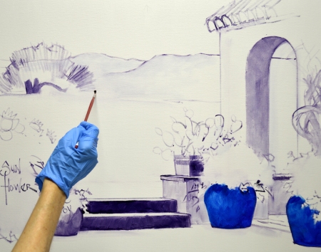
I’m beginning another commission! We are taking the Live Oak, Bluebonnets, Pansies, Sunflowers and Geraniums from this painting.
Then we’ll incorporate the Arch, Steps and Bougainvillea from the piece above.
So here is my sketch. The commission will be on a 30 inch tall by 36 inch wide gallery wrap canvas done with our White Senkarik Signature Frame. The actual size of the painting is 24 inches tall by 30 inches wide.
I’d like to show you our painting setup. My easel, palette and taboret are all on wheels, making it easy to configure the setup to fit any size piece. I work under daylight corrected florescent bulbs which guarantees my lighting is always consistent. This is a fancy four bulb fixture that we had our handy man install. BUT….when we were on the road we used two bulb shop lights, suspending them from the ceiling of the apartment or hotel room with eye bolts and chains. When we left we filled the tiny holes in the ceiling with spackling compound and no one ever knew any better!
The basic architecture is drawn on the canvas first with a thin wash of MUD (Ultramarine Blue + Alizarin Crimson) + Liquin. If you will click on the picture to enlarge it you can see our White Senkarik Signature Frame. The blue painter’s tape protects the area around the painting so I don’t get any paint on the frame. When I’m done, the blue tape is pulled off, revealing the clean frame underneath! The outer edge of the frame is wrapped with shrink wrap, keeping me from getting any fingerprints or paint on it.
My collector was thinking about having a couple of the containers either blue or teal. So I’m going to wash them in with a mix of Ultramarine Blue + Pthalo Blue + Liquin to give Deb an idea of how they would look. This is just an initial wash in, they can always be changed later.
A Prickley Pear will be planted in the rectangular container behind the blue ones.
Now I draw in the Texas hills and majestic Live Oak in the background. We had several of these oaks at our previous home. A tree expert told us they were over 300 years old. I wish those massive trees could talk, can you imagine the stories they would tell?
Flowers are labeled so I don’t forget our initial plan! I’ve certainly been known to do that when I get painting. Sometimes it seems like the brush takes over and I just hold on. Who knows what will happen then! Thanks for following along. If you would like to receive an email every time I publish a new post please feel free to subscribe to my blog. CLICK THIS LINK and scroll to the upper right side of the page. You will see a heading EMAIL SUBSCRIPTIONS. Just enter your email address and click the button “Sign me up!” It’s easy. And if you enjoy my blog please CLICK the FaceBook LIKE Button. As we say in Texas, “Much Obliged!


October 27, 2016 at 7:56 PM |
I love your posts and notes and just all that you do! You are so amazingly talented and so inspirational!!! God Bless you!!
October 27, 2016 at 10:23 PM |
This is so cool to see from an artist’s design development! Thank you for sharing.
October 28, 2016 at 12:48 AM |
Oh…this reminds me of a warm sunny Texas summer day. How could anyone not feel filled with beautiful thoughts when looking at this painting? It isn’t even finished and I already feel good vibes! Good Job Mikki! I love the 2 additional paintings that you used to create the new painting for your client. Yes…sometimes the brush does take over. Your studio set up is really great to. I love the daylight bulbs…sending hugs to you.
October 28, 2016 at 3:59 AM |
Hi just discovered you about six months ago after I ordered one of your husbands books. I love your work and I am learning so much from you. Could you please tell me what the milk carton on the left (with the top cut out) is for, and what brand of oil paint you like to use. Thank you so much!
October 28, 2016 at 9:57 AM |
Hi Joanie, I’m thrilled you found my blog. The plastic container on the left is a gallon water jug. I use it for my Turpenoid Odorless Thinner. We tried milk jugs but no matter how much we washed them, they still smelled after a couple of days. I use mostly Winsor Newton WINTON oil paints. The only one on our regular palette of colors that is not is the Pthalo Blue, I use Grumbacher Pre-Tested Professional Thalo Blue. Seems like everyone spells Pthalo differently. The color is more intense and perfect for my Santa Fe doors. Here is a link to our color mixing system that Jack developed:
Always feel free to ask questions. HAPPY PAINTING, Mikki