Archive for February, 2020

Everlasting Memories

February 28, 2020

The rugged stone wall is topped with terra cotta pavers. They are painted with several mixes of MUD (2 parts Ultramarine Blue + 1 part Alizarin Crimson) + Cadmium Orange + Cadmium Red Light + White.

VIDEO DEMONSTRATION: Planting Snapdragons and Nasturtiums

More Magenta Snapdragons are planted in the container at the front of this grouping. The buds at the top of the flowers are a mix of Phtalo Blue + Cadmium Orange + White.

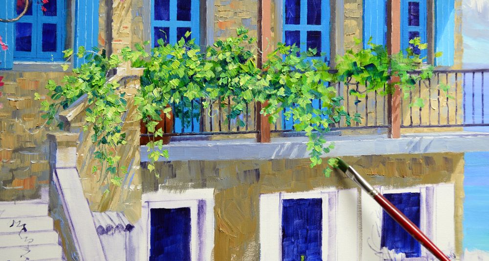
Sweet Potato Vine casts heart shaped shadows as it cascades over the edge of the terra cotta pot and down the rock wall. It’s fun to add just a little touch of romance for my collectors!

White Daisies are blocked in with combinations of White + Ultramarine Blue, White + Pthalo Blue and White + Dioxazine Purple. Foliage, made of Pthalo Blue + Cadmium Orange + White, is painted around the masses of white, helping to give shape to the flowers.

The centers of the Daisies are first made with MUD + Liquin.

Second, a dot of Cadmium Yellow Medium is placed within that dark center. For the flowers in shadow a mix of Cadmium Yellow Medium + Cadmium Orange + a little MUD is used. Then a tiny speck of MUD is made right in the middle of the Yellow. To see this better you may click on the image to enlarge it.

Sassy Sunflowers fill the container below the Daisies.

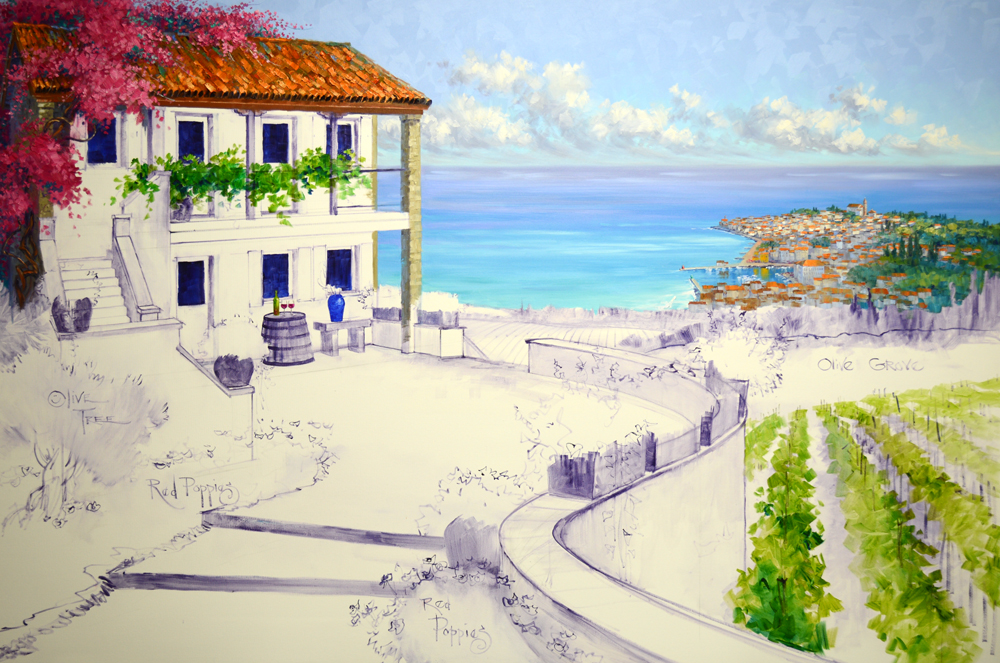
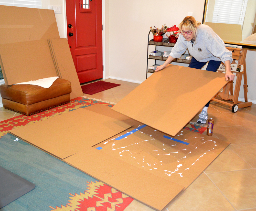
Red Poppies line the wall and continue onto the lower edge of the large, gallery wrap canvas. My neighbor helped me take the entire unit of Canvas and Cardboard off the easel and place it upside down on the floor. Having the canvas attached to the cardboard made it much easier to handle the wet painting, otherwise it would have been extremely difficult.

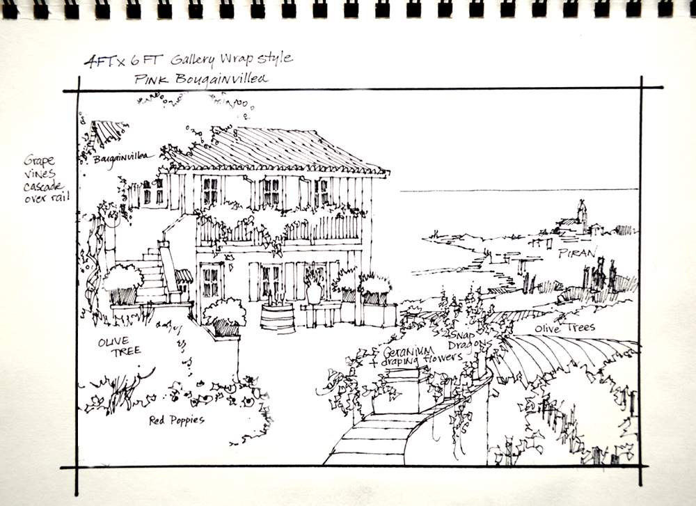
“Everlasting Memories”    48 inches by 72 inches

TA DA… DRUM ROLL… We’re Done! “Everlasting Memories” is ready to fill Andie and Michel’s hearts, as well as their new home, with happy remembrances of delightful times in Puce and Piran! Thank you everyone, for all of your kind words and encouragement. With Grateful Hugs,

Mikki Senkarik signature JPEGALL SENKARIK IMAGES ARE PROTECTED UNDER INTERNATIONAL COPYRIGHT LAW

Painting the Floor

February 26, 2020

The entire terrace surface is covered with mixes of MUD (2 parts Ultramarine Blue + 1 part Alizarin Crimson) + Cadmium Orange + White, MUD + Cadmium Orange + a little Pthalo Blue + White and Ultramarine Blue + Cadmium Orange + White. The cooler colors are used closer to the building, slowly transitioning to warmer ones on the front part of the terrace. As you read through my blog you may click on any of the images to view them larger.

The floor is completely covered, notice how I’ve established the light and shadow patterns. The broken color has been applied with heavy, textured brushstrokes to give the feel of the variation of hues in the irregular stones. Now, let’s put in the grout lines…..

VIDEO DEMONSTRATION: Painting the Grout Lines in the Floor

“Painting Forward” I now work on the two lower levels, painting them in the same sequence as the upper portion of the irregular stone terrace. These two levels fall into a shadow cast by the wall and the containers of colorful flowers lining the top of it.

Several of the large, rectangular containers on the wall are going to be planted with Nasturtiums and Snapdragons. The ones closest to the family home are painted first.

I still have a little more work to do on the floor, softening some of the edges. We’ll be planting the rest of the containers in our next session. Why don’t you grab some garden tools and gloves so you can help! Thank you for all of your kind and encouraging comments. See you! Hugs,

Mikki Senkarik signature JPEGALL SENKARIK IMAGES ARE PROTECTED UNDER INTERNATIONAL COPYRIGHT LAW

Rock Wall and Red Poppies

February 24, 2020

Several of you have asked about the color recipes for the rock building so here they are! #1: MUD (2 parts Ultramarine Blue + 1 part Alizarin Crimson) + Liquin. #2: 7 combinations in various proportions of MUD + Cadmium Yellow Medium + Cadmium Orange + White. #3: White + Ultramarine Blue. #4: MUD + Ultramarine Blue + White. #5: 3 shades of Ultramarine Blue + Cadmium Orange + MUD + White. The paint lined up on the left side of my palette is saved from the sky, ocean and tile roof.

The outer wall of the staircase is covered with the #2 mixtures. The different shades are jumbled together with heavy texture to give the feeling of the rough stones.

The top edges of some of the rocks are highlighted. This is done randomly or impressionistically, I don’t want to outline each and every stone.

The #5 mixes are used for the staves, or wood planks, of the old wine barrel. The hoops, the metal bands holding the staves together, are made of Cadmium Red Deep. They are highlighted with Cadmium Red Light. Alizarin Crimson is used for the red wine in the glasses. Please keep in mind, you may click on any of the images to see them larger.

Red and Pink Geraniums POP with the blue door behind them. They are painted in my usual sequence of “Flowers First, Leaves Last”.

Yellow Gladiolas fill the Ultramarine Blue ceramic vase on the stone table.

VIDEO DEMONSTRATION: Blocking in the Red Poppies

The wine barrel mixes are also used for the gnarled trunk of the Olive Tree surrounded by the Red Poppies.

Foliage made of Pthalo Blue + Cadmium Orange + White is painted around the delicate blossoms that were blocked in with Cadmium Red Deep, Cadmium Red Deep + Cadmium Red Light and Cadmium Red Light.

The final step in painting the Poppies is to add the dark centers with a mix of MUD + Liquin.

The silvery leaves of the Olive Tree are also painted with combinations of Pthalo Blue + Cadmium Orange + White. But these mixes have more Cadmium Orange than those of the Poppy foliage, which contain more Pthalo Blue.

Poppies march up the terrace steps, providing a parade of brilliant Crimson that leads the viewer into the painting! The floor will be next, please do come watch! With Colorful Smiles,

Mikki Senkarik signature JPEGALL SENKARIK IMAGES ARE PROTECTED UNDER INTERNATIONAL COPYRIGHT LAW

The Villa

February 21, 2020

Construction begins on the old family home. First, the rock wall of the upstairs was painted with several combinations in various proportions of MUD (2 parts Ultramarine Blue + 1 part Alizarin Crimson) + Cadmium Orange + Cadmium Yellow Medium + White. Then the iron railing is drawn over the wet paint of the ocean and building with a mix of MUD + Liquin. My wrist rests on the mahl stick to steady my hand as I draw the vertical lines. Please remember as you read through my blog, you may click on any of the pictures to view enlargements.

The doors, windows and shutters are mixes of Pthalo Blue + White.

VIDEO DEMONSTRATION: Painting the Grape Vine meandering along the porch rail

The wall of the first story has been painted and long tendrils of the vine are allowed to drape down below the porch floor.

The window, shutters and wall behind the Bougainvillea have been completed so I can now put the finishing touches on the colorful vine with mixtures of Permanent Rose + White.

Decorative arches are part of the stone work over the windows and doors. The keystone is a mix of Ultramarine Blue + Cadmium Orange + White.

The lantern by the front door is painted into the rock wall that is still wet.

The basic structure of the villa is done, we’ll be working on some of the special accoutrements in our next session! See you soon! With Colorful Smiles,

Mikki Senkarik signature JPEGALL SENKARIK IMAGES ARE PROTECTED UNDER INTERNATIONAL COPYRIGHT LAW

Vineyards and Olive Groves

February 19, 2020

I continue to “Paint Forward”, working now on the distant trees and vineyard beyond the terrace steps. The vines are painted with cooler greens made of Pthalo Blue + White + a touch of Cadmium Orange and a little Lemon Yellow. Near the vines at the back a few strokes of Pthalo Blue + White are made to cool them so they’ll recede. You can see this better if you’ll enlarge the image, just click on the picture.

Now I work on the trees behind the Olive grove, they are blocked in with combinations of Ultramarine Blue + Lemon Yellow + Cadmium Yellow Medium. The soft blues of the buildings of Piran peek through the dark trees.

Olive Trees are painted with mixes of Pthalo Blue + Cadmium Yellow Medium + Cadmium Orange + White. Some of the Pthalo Blue + White mixture from the most distant vineyard is also used here for the trees farthest away from the viewer to make them drop back.

The ground of the closest vineyard is covered with mixes of MUD (2 parts Ultramarine Blue + 1 part Alizarin Crimson) + Cadmium Orange + White. More Ultramarine Blue and White is added for the back edge of the field. The lighter blue makes it recede.

The vines farthest away are made with Pthalo Blue + Cadmium Yellow Medium + White and Pthalo Blue + White. Moving forward Ultramarine Blue + Lemon Yellow + White is used. This color is warmer, giving the vines the appearance of being closer.

Posts supporting the vines are drawn into the wet paint of the ground with a mix of MUD + Liquin.

Sunlight dances across the tops of the large grape leaves, highlights are mixes of Ultramarine Blue + Lemon Yellow + White.

The vista that spreads out before the grand, old family home is complete. Construction begins in our next session. Why don’t you grab some heavy gloves and come give me a hand? Before I go I’d like to thank you for all of your kind and encouraging comments! With Big Hugs,

Mikki Senkarik signature JPEGALL SENKARIK IMAGES ARE PROTECTED UNDER INTERNATIONAL COPYRIGHT LAW

Village of Piran

February 17, 2020

The Bougainvillea is allowed to cascade down the side of the building, then the gnarled trunk is added.

Now let’s head back to the ocean. Painting “Forward” from the horizon line the color becomes progressively more intense. The water closest to the junction of sky and sea is MUD (2 parts Ultramarine Blue + 1 part Alizarin Crimson) + Ultramarine Blue + White. Then mixes of Ultramarine Blue + White are used. The area behind the village is being painted with Ultramarine Blue + Pthalo Blue + White.

The ocean directly to the left of the distant village is made with Pthalo Blue + White. The shallower water closest to the viewer is mixes of Pthalo Turquoise Blue + White.

Now let’s begin working on that quaint little village by the sea! In the reference picture the light comes into the photo from the left. In the painting the sunlight spills into the scene from the right. So the light parts of the buildings in the picture above will be dark and vise versa!

VIDEO DEMONSTRATION: Village of Piran

A shaft of sunlight splashes across the trees and village. The highlights of the trees are mixes of Pthalo Blue + Cadmium Yellow Medium + White. You may click on the image to view it larger.

A yellow building resides by the harbor, you can see it in the picture of Piran shown earlier in this post. It’s made with Cadmium Yellow Medium + a bit of MUD + White.

Just for fun a few red umbrellas are added by the yellow building. Next, short brushstrokes of White + Ultramarine Blue are made into the wet paint of the harbor to indicate the boats.

The village is complete, here’s a closeup!

Vineyards and Olive Groves will be next, hope you’ll come watch! HUGS,

Mikki Senkarik signature JPEGALL SENKARIK IMAGES ARE PROTECTED UNDER INTERNATIONAL COPYRIGHT LAW

Up on the Ladder

February 15, 2020

Let’s start painting! Up on the ladder I go to paint the sky and top edge of the gallery wrap canvas. The upper portion of the sky is covered with a mix of White + Cobalt Blue, the part nearest the horizon is White + Pthalo Blue.

The clouds are painted, wet-into-wet, over the blue. This allows me to make the edges of the clouds feathery and soft. The shadows are combinations of MUD (2 parts Ultramarine Blue + 1 part Alizarin Crimson) + a touch of Cadmium Orange + White and MUD + Ultramarine Blue + a little Cadmium Orange + White. The sunlit portions are White + bit of Cadmium Orange.

The moisture in the atmosphere softens the line where the ocean meets the sky. The horizon is first drawn into lower edge of the sky with a mix of MUD + Ultramarine Blue + White. Notice the hard edge to the right of my brush, you may click on the image to view it larger to see this better. Then I come back and make a zig-zag along the entire horizon line (look to the left of my brush).

The final step in softening the horizon is to take a clean brush and pull it over the zig-zags. This intermingles the sky/sea intersection, making the line fuzzy or soft. The softened line falls into the distance, whereas the original line that was sharper and more distinct would have come forward.

VIDEO DEMONSTRATION: Up on the Ladder, Blocking in the Bougainvillea

The Bougainvillea is painted over the edge, onto the side of the gallery wrap canvas.

The tile roof is painted with several different combinations in different proportions of MUD + Cadmium Orange + a tiny bit of Pthalo Blue + White, Ultramarine Blue + White and Cadmium Orange + Pthalo Blue + White. The color is applied with heavy texture to give the feel of the old, terra cotta tiles.

The rounded ends of the tiles overhanging the fascia are made with a square Bright brush about 1/4 inch wide. The brush, dipped in a mixture of MUD + Liquin, is twisted as I apply the paint.

Notice how the sharp, defined edges of the roof and Bougainvillea pop in front of the soft sky and horizon line. Also the warm colors of the roof bring it forward from the cooler blues in the background. Thanks for following along today, see you in our next session. With Colorful Smiles,

Mikki Senkarik signature JPEGALL SENKARIK IMAGES ARE PROTECTED UNDER INTERNATIONAL COPYRIGHT LAW

Finishing the Sketch on Canvas

February 14, 2020

Work continues on the old home place, it’s time to put all the doors and windows in. Please keep in mind, you may click on this or any of the other images to see enlargements.

A grape vine lazily rambles along the upstairs porch railing. The leaves are washed in with mixes of Sap Green + Liquin and Pthalo Blue + Liquin.

An old wine barrel, cut in half, provides the perfect place to serve a couple of glasses of vino! The blue vase on the table will be filled with Gladiolas.

After looking at the large expanse of terrace floor I decide to break it into 3 levels by adding a couple of steps. This makes the space more interesting.

The shape of the peninsula in the distance, where the village of Piran is located, is now washed in.

Rows of grape vines at the foot of the terrace wall are washed in with mixtures of Viridian Green + Liquin, Sap Green + Liquin and Pthalo Blue + Liquin. You can see my reference photo on the laptop sitting on the taboret to the right of my easel.

Even at this stage you are able to see how the design of the painting works. The rows of the vineyard point you to the village of Piran in the background. Then the pier directs your eye to the left, toward the beautiful old home on the bluff. Poppies will dance along both sides of the walk up to the house and flower pots line the curved wall. When we get finished the brilliant colors of the flowers along the terrace walk will also guide the viewer directly to the front door.

Last, but not least, I just want to say how much I appreciate you and am so thankful for you being part of my life. It’s amazing how my collectors and blog readers have become friends. The friendship and support you have extended to me over the years has been overwhelming. Your encouraging and inspiring messages are so filled with love. You’re always there for me and I’m forever grateful. You are my Valentines, each and every day!

With heartfelt wishes for a HAPPY VALENTINE’S DAY!

Mikki Senkarik signature JPEGALL SENKARIK IMAGES ARE PROTECTED UNDER INTERNATIONAL COPYRIGHT LAW

Slovenia – Here We Come!

February 12, 2020


Bet you’ve been wondering what I’m going to paint on that BIG canvas that we’ve prepared! Well, we’re off to Slovenia where Andie and Michel have very close family ties. Andie’s grandfather built this home in Puce, her mother lived there and it has now been refurbished by her cousin.

Piran is a delightful village with architecture reminiscent of Venice, that’s a few miles away on the Adriatic Coast. Michel said he and Andie have wonderful memories of visits to this very special place.

The joy of being an artist is that I can magically whisk the family home in Puce to a bluff, overlooking vineyards, olive groves and the coastal village of Piran with absolutely no heavy lifting involved! Here’s my sketch.

ALRIGHT…. Let’s get to work on that blank canvas. First the perspective guidelines for the family home are drawn using a T-Square. You may click on the image to view an enlargement which will show the pencil lines more clearly.

The basic guidelines for the structure and terrace are complete. Time to begin establishing the drawing in more detail with an oil wash.

The reference picture is taped to my canvas with Painter’s tape which won’t leave any sticky residue. A mix of MUD (2 parts Ultramarine Blue + 1 part Alizarin Crimson) + Liquin is used to start delineating the building.

The basic plan is beginning to take shape! We’re at a higher viewpoint and looking a little bit down on the old family place, so it’s at a slightly different angle than in the reference picture.

I constantly check the drawing in the large mirror placed across the room, directly behind me. This allows me to view the image in reverse, making it easy to see any errors in my basic sketch or the perspective.

I change the wall of the terrace from my original drawing in my sketchbook. The lazy “S” curve is more pleasing and will gracefully lead the viewer into the painting, right up to the front door.

An Olive Tree and Red Poppies nestle at the bottom of the stone stairway. AND…. I’ll be planting more Red Poppies along the wall on the right of the curved terrace! We’ll continue working on the oil wash sketch in our next session. I do hope you’ll come back and follow the progress! With Cheerful Smiles,

Mikki Senkarik signature JPEGALL SENKARIK IMAGES ARE PROTECTED UNDER INTERNATIONAL COPYRIGHT LAW

Prep Continues

February 10, 2020

This painting will be done in a gallery wrap style with the image extending over the edge, onto the sides of the canvas. So that means I have to mount it on a giant piece of cardboard that will extend 2 1/2 inches beyond the outside of the canvas, all the way around. This makes it much easier to paint the edges and handle the wet art. We purchase sheets of double ply cardboard that measure 40 inches by 48 inches. The backing needs to be 53 inches by 77 inches as the canvas is 48 inches by 72 inches. The first step is to draw up my plan in a sketchbook.

After cutting the cardboard into the specified sizes it’s time to begin assembling the 2 layer piece to mount the canvas on and a second, three layer sheet that will be the top of the shipping box. Please keep in mind as you read my blog, you may click on any of the images to view enlargements.

The four pieces are first taped together to make the first layer.

That initial layer is turned over and dotted with glue, then the second layer is placed on the first. The individual pieces are placed so the seams alternate from layer to layer. The backing for the painting is two layers, the top of the box is three.

The seams on the outer surface of each layer are taped so no glue seeps through. This also guarantees that none of the edges will break loose in shipping. It would be disastrous if a cardboard corner pierced the finished painting!

The canvas is placed on top of the large sheets to keep them flat as they dry overnight.

The next morning I install screw eyes into the outer stretcher bars. These will be used for wiring the canvas to the cardboard and will provide stronger support.  The system I use for smaller canvases with the screw eye poking up through the cardboard and a nail inserted through the eye to anchor the painting won’t work for this heavy canvas.

Before anchoring the canvas to the backing I attach the hanging wire as well as label the back of the art with the Title, the Code of Authenticity Number, Copyright, my Signature, a Personal Sentiment for my collectors and my Website Address. Two hangers with nails are taped to the hanging wire for my collectors’ convenience.

Marks are made on the cardboard to correspond with the location of the screw eyes in the canvas, then holes are poked through the backing cardboard with an ice pick.

12 inch lengths of wire are inserted through each pair of screw eyes before placing the canvas, face down, on the floor. There are 8 sets of screw eyes, 2 in each corner of the large canvas. You can see the placement of all of the screw eyes in the picture of the back of the canvas.

The backing cardboard is placed on top of the canvas, the wires pushed through the holes, twisted and tighten with pliers. I’ve put a small piece of cardboard under the wire to prevent it from tearing through the backing.

That is then taped over with several layers of painter’s tape. This secures the ends of the wire, don’t want them to scratch anyone!

Knowing how the painting is attached to the backing will help my collector when they unbox the art! The entire unit, Canvas and Cardboard Backing, is placed on the easel and I’m ready to begin sketching the composition up with a thin oil wash. Hope you’ll come follow along!

If you would like to receive an email every time I publish a new post please feel free to subscribe to my blog. CLICK THIS LINK and scroll to the upper right side of the page. You will see a heading EMAIL SUBSCRIPTIONS. Just enter your email address and click the button “Sign me up!”  It’s easy. Please keep in mind, to move through the blog when you get the posts just CLICK on the small titles at the top of the page. The right one for the next post or the title on the left side for the previous session. Thank you for subscribing! With Colorful Smiles,

Mikki Senkarik signature JPEGALL SENKARIK IMAGES ARE PROTECTED UNDER INTERNATIONAL COPYRIGHT LAW