Archive for September, 2022

The New Look of TRANQUIL SEA

September 30, 2022

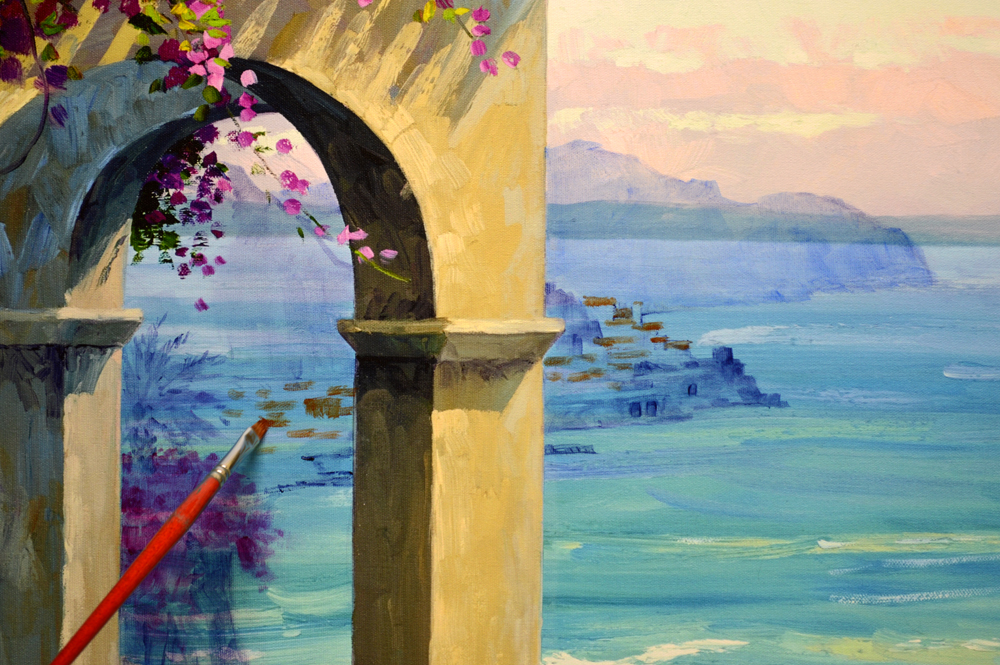
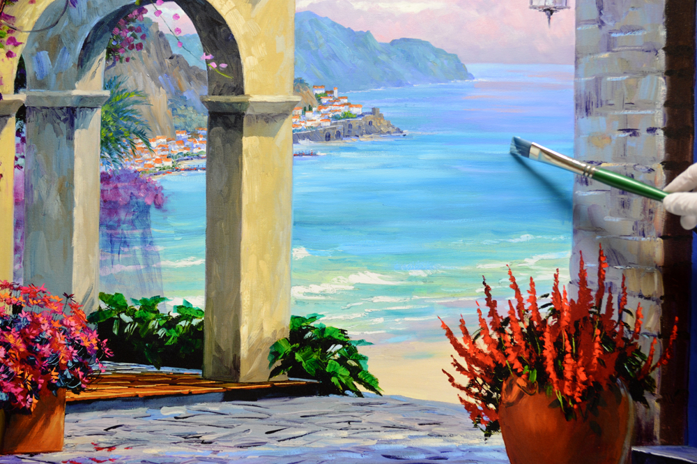
The Mediterranean Sea is repainted. A shaft of sunlight breaks through the clouds, streaming across the azure water to illuminate the village of Amalfi. Please keep in mind as you read my post, you may click on any image to see it larger.

Gentle waves break along the beach, beckoning the viewer to take the trek down the steep, cobblestone lane to dip their toes in the warm water.

Magenta + White is used for the Bougainvillea cascading over the rocky bluff.

The Bougainvillea draping over the arches of the porch is painted with warmer mixes of Magenta + Permanent Rose + White. The mixes used for the distant Bogie are cooler, making it recede and increasing the feeling of depth in the painting.

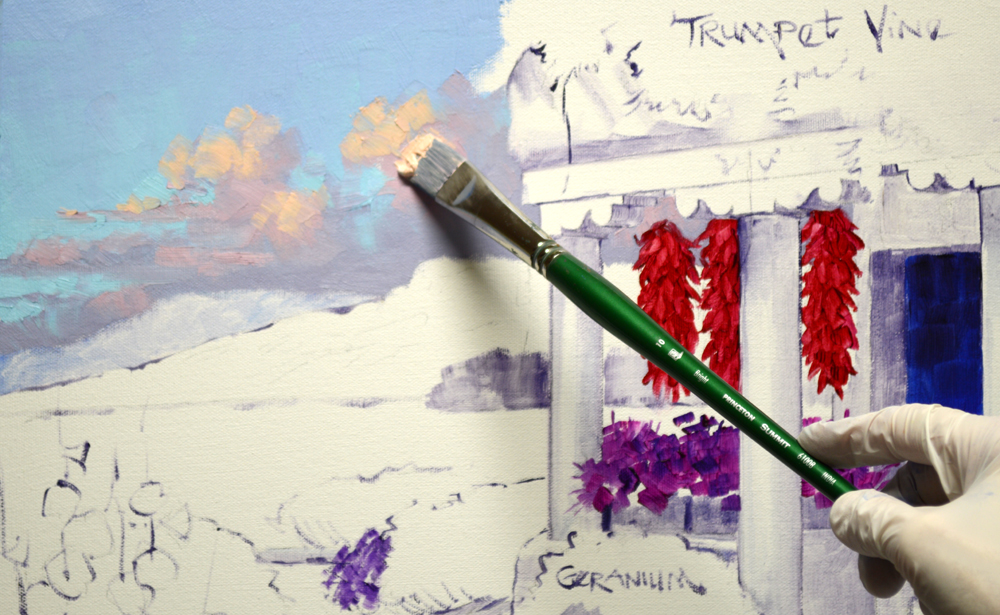
The White Vine tumbling down the house at #7 via Dell’amore is repainted. Since it’s completely in shadow I used combinations of White + Dioxazine Purple, White + Ultramarine Blue and White + Pthalo Blue for the flowers. What does via Dell’amore mean? It’s Italian for “Street of Love”!

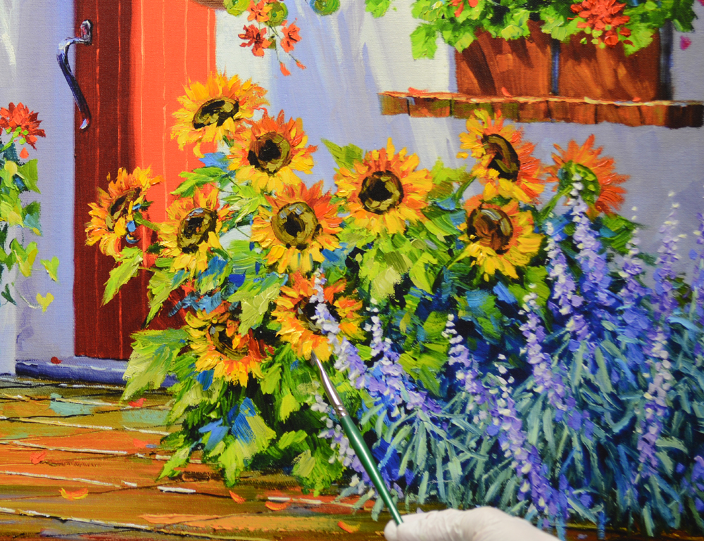
After the leaves and vines are finished, the deep centers of the blossoms are added with Alizarin Crimson + Liquin Original.

The Penstemon is painted LEAVES FIRST, FLOWERS LAST. This is opposite my usual sequence of FLOWERS FIRST, LEAVES LAST. I work in this way because the tall spiky flowers are mostly above the foliage.

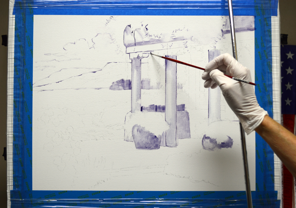
Towering seed pods are delineated last.

Painting the Daisies I go back to FLOWERS FIRST, LEAVES LAST. On this plant the flowers are a mass of Permanent Rose + White, Cadmium Red Light + White and Cadmium Orange.

After the leaves are painted, the bright centers of the Daisies are made with Cadmium Lemon Yellow.

TA DA! The New Look of TRANQUIL SEA!

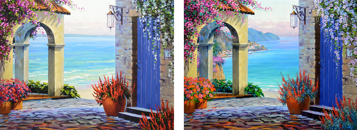
Here’s the BEFORE and AFTER. I’m thankful to see my skills have grown a little since TRANQUIL SEA was originally painted in 1995. Thank you for following my blog, I really appreciate you! With Big Hugs,

ALL SENKARIK IMAGES ARE PROTECTED UNDER INTERNATIONAL COPYRIGHT LAW

© Senkarik 2022

www.senkarik.com

Amalfi-ized!

September 28, 2022

Working on embellishing another of the LIMITED ORIGINAL Giclees that was destroyed in the fire at my collector’s home. My original oil, TRANQUIL SEA, was painted in 1995 at about the same time I did SOLITUDE, just shown on my blog. Please keep in mind as you read through my blog, you may click on any image to see an enlargement.

I’m going to change the background, moving this scene to the Amalfi Coast of Italy. We begin by sketching in the picturesque coastline with a thin oil wash of MUD (2 parts Ultramarine Blue + 1 part Alizarin Crimson) + Liquin Original.

The tile rooftops of the village of Amalfi are added with another oil wash made of Burnt Sienna + Liquin Original.

The sky is painted down, over the coast that originally stretched along the horizon. Clouds are accented with the warmth of the Mediterranean sun.

We’re ready to start painting the distant bluffs……

The most distant one is covered with several mixtures, in various proportions, of Pthalo Blue + Cadmium Orange + MUD + White. Waves crash against the base of the bluff. They are indicated by a fine, broken line made of White + Ultramarine Blue.

The rocky cliffs of the Amalfi peninsula are combinations of MUD + Cadmium Orange + White. Before the area behind the large palm dries, the arching fronds are painted wet into wet over the background.

The white stucco buildings are first blocked in with a jumble of White + Ultramarine Blue, White + MUD and pure White brushstrokes. Roof tops are added with combinations of Cadmium Orange + MUD + White, changing the appearance from a mish-mash of color to a village!

More roof tops, trees, beach, jetties, seawall and ancient guard tower complete the coastal village.

TRANQUIL SEA is now Amalfi-ized. Hope you’ll come back for our next session to watch me embellish the rest of this Limited Original.

I’d like to invite you to subscribe to my blog, you’ll receive an email every time I publish a new post. CLICK THIS LINK and scroll to the upper right side of the page. You will see a heading EMAIL SUBSCRIPTIONS. Just click the button “Sign me up!”  It’s easy. Please keep in mind, to move through the blog when you get the posts, just CLICK on the small titles at the top of the page. The one on the right for the next post or the title on the left side for the previous session.

I appreciate you subscribing to my blog! With Big Hugs,

ALL SENKARIK IMAGES ARE PROTECTED UNDER INTERNATIONAL COPYRIGHT LAW

© Senkarik 2022

www.senkarik.com

SOLITUDE Transformed

September 27, 2022

Work continues on the transformation of SOLITUDE. The window sash and shutters are painted with Pthalo Blue + White. You may click on any picture to see an enlargement.

The terra cotta container on the sill is filled with luscious Red Geraniums.

Cadmium Red Deep + Magenta, Cadmium Red Deep and Cadmium Red Light are used to repaint the Geraniums in the flower pot on the porch. The petals illuminated by the sun are highlighted with Cadmium Red Light + White.

Magenta + White Hollyhocks stand tall behind the fountain.

Spiring stems, covered with the distinctive seed pods of the Hollyhocks, are made with varying mixes of Sap Green + White.

African Daisies provide a cheerful greeting at the foot of the stairs. Their colorful blossoms were painted with Cadmium Red Light + Alizarin Crimson, Cadmium Red Light, Cadmium Orange and Cadmium Orange + Cadmium Yellow Medium. Then the unique centers are added.

Last, but not least, the Hot Pink Bougainvillea is repainted with several combinations of Permanent Rose + White, Geranium Lake + White, Cadmium Red Light and Cadmium Red Light + White.

SOLITUDE is TRANSFORMED!

Check out the Before and After! Now Cindy and Ron can enjoy the music of the cascading water as they gaze at their newly remodeled, Tuscan courtyard. Thank you for following my blog. I’ll be “Amalfi-izing” in our next session. What does that mean? COME AND SEE! Hugs,

ALL SENKARIK IMAGES ARE PROTECTED UNDER INTERNATIONAL COPYRIGHT LAW

© Senkarik 2022

www.senkarik.com

Transformation

September 26, 2022

SOLITUDE was one of my Limited Original, hand embellished Giclees on Canvas, that was in the fire in my collector’s home. To read my blog on restoring their extensive art collection CLICK HERE. Unfortunately, it was damaged beyond repair, so I have the opportunity to start on a fresh Giclee of my original. I’ll embellish it to hang in their new, redone home when they move back in. This is the unembellished Giclee, straight from Miguel, my wonderful printer and owner of ARTFINITY in Florida. If you’re interested in having Giclees made of your paintings I’ll be happy to provide you with his contact information. Just ask in the comment section below.

As you read through my blog, please keep in mind, you may click on any picture to see an enlargement.

Done in 1995, SOLITUDE is one of my earlier paintings. The ability to easily make changes is one of the things I enjoy most about embellishing my Limited Originals. Looking at my painting almost 30 years later, I realize I would like to add a few elements to make this an even more inviting Tuscan courtyard. The wall on the inside passage under the arch seemed very empty to me, let’s add a window with shutters!

And another terra cotta flower pot, nestled in the ivy at the base of the stairs. Just to give me an idea of how it will look, the basic shape is made with a thin oil wash of Burnt Sienna + Liquin Original.

Can’t have too many containers for flowers, so I’ve put one more on the sill of the new window! Next the door is glazed with a thin oil mix of Pthalo Blue + Liquin Original. This makes the color richer and more intense. Check out the area above my brush. It has been glazed, the area below has not.

I decide to completely repaint the Salvia hugging the lower basin of the fountain. The foliage is several mixes of Pthalo Blue + Cadmium Orange + White and Pthalo Blue + White.

The tall, spiky blossoms are Dioxazine Purple + White, Dioxazine Purple + Ultramarine Blue + White and Ultramarine Blue + White.

Cindy and Ron are such a wonderful couple. I want to celebrate their love with a special tile on the pedestal of the fountain.

At the time I painted this piece in 1995, I didn’t know how and was too timid to attempt to try to paint the water splashing out of the fountain. Now, having a few more miles on my brush, the plunge is made!

SOLITUDE is transforming before our eyes. We’ll be making more changes in our next session. Hope you’ll come back and join me.

I’d like to invite you to subscribe to my blog, you’ll receive an email every time I publish a new post. CLICK THIS LINK and scroll to the upper right side of the page. You will see a heading EMAIL SUBSCRIPTIONS. Just click the button “Sign me up!”  It’s easy. Please keep in mind, to move through the blog when you get the posts, just CLICK on the small titles at the top of the page. The one on the right for the next post or the title on the left side for the previous session.

I appreciate you subscribing to my blog! With Big Hugs,

ALL SENKARIK IMAGES ARE PROTECTED UNDER INTERNATIONAL COPYRIGHT LAW

© Senkarik 2022

www.senkarik.com

Embellishing DANCING LIGHT

September 23, 2022

I’m embellishing, or enhancing, a LIMITED ORIGINAL Giclee on Canvas of my Original Oil Painting, DANCING LIGHT. Why are these called LIMITED ORIGINALS? Because I paint extensively on each colorful, high resolution, digital image with oils; no two are exactly alike. I will repaint flowers and make changes or add a special item at a collector’s request. I sign them on the front, just like an original. So even though each is part of a limited edition, every single piece is original. Therefore Jack coined the term: LIMITED ORIGINAL.

My collectors asked that I take out the Sun Face part of the fountain. Painting over that, I’m going to replace it with an upper bowl that will spill water to the large, tile topped basin below. As you read through my blog do keep in mind, you may click on any image to see an enlargement.

Water cascading over the edge is painted by lightly dragging the brush straight down. Holding the handle very loosely allows the bristles to skip over the surface of the canvas. This makes uneven brushstrokes that give the impression of falling water.

My collectors also believe in Jesus, so I “carve” a cross on the weathered wooden beam over the fountain.

After highlighting the oranges and leaves on the tree to the left of the fountain, my attention turns to the three terra cotta containers that are filled with Nasturtiums. The flowers tumbling out of them are repainted with mixes of Cadmium Red Light + Alizarin Crimson, Cadmium Red Light + Cadmium Orange and Cadmium Orange.

The distinctive foliage of the Nasturtiums is combinations of Pthalo Blue + Lemon Yellow + Cadmium Yellow Medium.

Heart shaped leaves of a Sweet Potato Vine drape out from underneath the brilliant Red Geraniums in the tall container next to the fountain.

The large blooms of the cheery Sunflowers are made with various mixes of Cadmium Yellow Medium + MUD (2 parts Ultramarine Blue + 1 part Alizarin Crimson), Cadmium Yellow Medium + Cadmium Orange + MUD, Cadmium Yellow Medium and Cadmium Yellow Medium + Lemon Yellow.

Salvia, nestled at the base of the Sunflowers, is painted with mixes of Dioxazine Purple + White and Ultramarine Blue + White.

Several shades of Permanent Rose + White is used for the hot pink Bougainvillea pouring over the terra cotta tile roof.

The brilliant flowers, red door and white stucco building gleam in the DANCING LIGHT of the Mediterranean Sun! I appreciate you following along, please come back and visit my studio again soon!

ALL SENKARIK IMAGES ARE PROTECTED UNDER INTERNATIONAL COPYRIGHT LAW

© Senkarik 2022

www.senkarik.com

Sunset in Santa Fe

September 20, 2022

The entire surface of the Saltillo Tile floor is first covered with several mixes of MUD (2 parts Ultramarine Blue + 1 part Alizarin Crimson) + Cadmium Orange + White. This is to establish the light and dark pattern made as the warm sunlight splashes across the patio. Next, the perspective lines of the tiles are pulled into the wet paint with a fine brush dipped into a mix of MUD + Liquin Original. You may click on this image, or any of the others, to see an enlargement.

Then, horizontal lines separating the pavers are drawn.

Geraniums are blocked in FLOWERS FIRST, LEAVES LAST. The blossoms are combinations of Cadmium Red Deep + Magenta, Cadmium Red Deep, Cadmium Red Deep + Cadmium Red Light and pure Cadmium Red Light. The bright green foliage is various proportions of Pthalo Blue + Lemon Yellow and Pthalo Blue + White.

Chamisa is native to the Southwest. Cadmium Yellow Medium + MUD, Cadmium Yellow Medium + MUD + Cadmium Orange and Cadmium Yellow Medium + White are used for the soft flowers. The Grey-Green brushy stems are Pthalo Blue + Cadmium Orange + White.

Magenta Salvia lines the left side of the entry walk. Paint remaining from the foliage of the Chamisa was used for the Salvia.

Hot Pink Hollyhocks tower above the Salvia. The crepe papery flowers are made of Permanent Rose + White. I’ve added a little Cadmium Yellow Medium to the paint leftover from the Geranium leaves to use for those of the Hollyhocks.

Deep, dark centers are made in the Hollyhocks with Magenta + Liquin Original. Then the distinctive yellow stamens are added with Lemon Yellow.

We’re done. Let’s step out onto this pleasant patio, take in the view and bask in the warmth of the SUNSET IN SANTA FE! Thank you for following my blog, I appreciate all of you. With Colorful Smiles,

ALL SENKARIK IMAGES ARE PROTECTED UNDER INTERNATIONAL COPYRIGHT LAW

© Senkarik 2022

www.senkarik.com

Lintel Posts, Trumpet Vine and Chilis

September 18, 2022

The adobe structure is constructed with mixtures of MUD (2 parts Ultramarine Blue + 1 part Alizarin Crimson) + Cadmium Orange + a touch of Pthalo Blue + White. The bluer portion of the side wall has been overpainted with a mix of Ultramarine Blue + White. This will make it fall behind the wall along the front of the porch. The wall below the window is made darker, accentuating the corner. As you read through my blog, please remember, you make click on any of the pictures to see enlargements.

Guiding my brush along the side of the T-Square that is balanced on the top of my canvas, insures the Lintel Posts are straight and totally upright.

Several shades of Pthalo Blue + White are used to make the distinctive Southwest architectural details.

Trumpet vine cascades over the top of the rounded adobe porch. It’s blocked in with combinations of Alizarin Crimson + Cadmium Red Light + Cadmium Orange, Cadmium Red Light + Cadmium Orange and pure Cadmium Orange.

Leaves have been added with mixes of Cadmium Yellow Medium + Pthalo Blue and some of the Blue mixes remaining from the Lintel Posts. Then the deep centers of the Trumpet Vine blossoms are made with a thin mix of Magenta + Liquin Original.

Chili Ristras are another distinctive Santa Fe touch. Cadmium Red Deep + Magenta, Cadmium Red Deep + Cadmium Red Light and Cadmium Red Light are used for the hot peppers. Highlights are made with Cadmium Red Light + White.

Large terra cotta containers are mixes of MUD + Cadmium Red Light + Cadmium Orange and MUD + Cadmium Red Light + Cadmium Orange + White. The rectangular ones, balanced on top of the porch wall, are filled with lush, Magenta Petunias. We’ll finish up in our next session, hope you’ll come back to help me tile the floor and plant the rest of the landscaping! With Big Hugs,

ALL SENKARIK IMAGES ARE PROTECTED UNDER INTERNATIONAL COPYRIGHT LAW

© Senkarik 2022

www.senkarik.com

Painting the Santa Fe Background

September 15, 2022

Even though the outline of the basic composition has been transferred to the canvas, before actually starting to paint I still do my usual oil wash sketch with thin mixes of MUD (2 parts Ultramarine Blue + 1 part Alizarin Crimson) + Liquin Original. To view enlargements of any of the pictures, just click on the image.

I’m so used to working in this method, I’ve found when I don’t do my initial oil wash sketch I get into trouble later as the painting progresses.

I’ll begin painting with the sky. Since I’m following the original painting so closely, I have the image on my laptop, right next to my easel. I’ve enlarged it so my reference is clearly visible.

The color mixes for the sky are as follows. #1. White + Phtalo Blue. #2. White + Cobalt Blue. #3. White + MUD. #4. White + MUD + Alizarin Crimson. #5. White + Cadmium Red Light + Cadmium Orange. The dabs of paint on the left of my palette are from the painting I finished before this one.

After painting the blue field of the sky, the clouds are added. Shadows are painted first, I finish up by adding the warm highlights from the setting sun.

The farthest bluffs are made bluer so they recede. The late afternoon sun illuminates the closest mountain ridge, giving it a warm glow.

Dark trees along the back of the meadow accentuate the light dancing on the clouds and rocky bluff.

Purple Asters and Chamisa blanket the field behind our adobe structure. The Purple Asters are combinations of Dioxazine Purple + White and Dioxazine Purple + Ultramarine Blue + White. Several mixes of Cadmium Yellow Medium + MUD + White are used to block in the Chamisa.

Our Santa Fe Background is done! We’ll begin construction on the building in our next session. Come give me a helping hand! With Colorful Smiles,

ALL SENKARIK IMAGES ARE PROTECTED UNDER INTERNATIONAL COPYRIGHT LAW

© Senkarik 2022

www.senkarik.com

IDENTICAL

September 13, 2022

My Santa Fe gallery called with an unusual commission request. My new collector wanted me to repaint a piece of mine that the gallery had already sold. Now, that has happened quite a few times over my career. BUT, the unusual part was they wanted it to be IDENTICAL to the original piece. I told Kristen, the owner, that I couldn’t possibly duplicate the painting, brush stroke for brush stroke. The painting would not be IDENTICAL to the original but would be the same layout, have the same placement of elements and same flower colors. Receiving the client’s GO AHEAD I enlarge the original image to the exact size it will be painted. Then it’s printed on 4 different 8 1/2 x 11 inch pages which I tape together.

Please remember, you may click on any of the images to see enlargements.

Using a 6B carbon pencil, I begin scribbling all over the back of the printed out pages.

I make sure to cover the entire surface. This will be my ‘Carbon Paper’ to transfer the image to my canvas.

The printed out image is taped to the canvas, carbon side down. A T-Square is used to make sure the upright lintel posts on the porch are perfectly straight.

A ball point pen is used to trace over the printed image, transferring the composition to the blank canvas.

The paper is lifted occasionally, making certain I haven’t missed any details.

The canvas with the transferred drawing is now placed up on my easel. We’re ready to begin painting in our next session, hope you’ll come watch.

I’d like to invite you to subscribe to my blog, you’ll receive an email every time I publish a new post. CLICK THIS LINK and scroll to the upper right side of the page. You will see a heading EMAIL SUBSCRIPTIONS. Just click the button “Sign me up!”  It’s easy. Please keep in mind, to move through the blog when you get the posts, just CLICK on the small titles at the top of the page. The one on the right for the next post or the title on the left side for the previous session.

I appreciate you subscribing to my blog! With Big Hugs,

ALL SENKARIK IMAGES ARE PROTECTED UNDER INTERNATIONAL COPYRIGHT LAW

© Senkarik 2022

www.senkarik.com

Wake Up to the Cote d’Azur

September 7, 2022

The pitcher holding the flowers is painted with several shades of Ultramarine Blue + White. As you read through my blog, please remember that you may click on any of the images to see them larger.

Cheery Sunflower Blossoms are blocked in using Cadmium Red Light + Cadmium Orange, Cadmium Yellow Medium + Cadmium Orange + a little MUD (2 parts Ultramarine Blue + 1 part Alizarin Crimson) and Cadmium Yellow Medium.

The dark centers are first put in with a mix of MUD + Liquin Original. Then some of the flower color is dragged into the dark to make the lighter, outer portion of the centers.

The Sunflower petals illuminated by sunshine have been highlighted with Cadmium Yellow Medium + Lemon Yellow. Then the tall, spiky blooms of the Angelonia were made with various mixes of Magenta + White. Moving to the wicker fruit basket, the distinctive texture is painted with mixtures leftover from the tile floor.

Grapes, spilling out of the basket, are combinations of Viridian Green + Cadmium Yellow Medium + White.

Wouldn’t it be fun to wake up in the morning, walk out and have breakfast on this pleasant terrace overlooking the Cote d’Azur? I can just feel the cool breeze and hear the waves crashing against the bluffs in the distance.

Enjoy this Video Progression of “Wake Up to the Cote d’Azur”, that shows the painting process from beginning to end. I appreciate you following my blog; hope you’ll come back to see what’s going to be next up on my easel! With Colorful Smiles,

ALL SENKARIK IMAGES ARE PROTECTED UNDER INTERNATIONAL COPYRIGHT LAW

© Senkarik 2022

www.senkarik.com