Archive for January, 2011

Traveling Back in Time

January 31, 2011

One of our collectors visited Turkey this past summer and sent us some of the pictures taken on their trip. My immediate reaction was, “What fun to paint.” We emailed back and forth several times, brainstorming on various themes. We finally decided to combine several locations. The coastal village of Alacati is very picturesque, full of good memories for my collector and his family. We selected a couple of street scenes as a base for the foreground. My collector came up with a super idea. He said, “I would love to capture the feel of sitting at the sidewalk cafe overlooking the ancient ruins in the distance.”

Another quaint Alacati street scene.

The Library of Cestus is to be the main element in the distance.

So, bring out the sketchbook! I so enjoy collaborating with my collectors on their special pieces. It’s a fun challenge to take all of the ideas and combine them into a painting. Feel free to visit the studio tomorrow and see how it comes together in the sketch. Hugs, Mikki Senkarik

Website: http://www.senkarik.com

My Painting Setup

January 27, 2011

One of my readers asked a couple of really great questions. One was, “What’s in the milk jug on the left of my palette?” It’s our odorless paint thinner. We drink bottled water so that is actually a water jug. The top is cut off leaving the handle. We tried using plastic milk jugs for the same purpose but no matter how much I washed them first, they began to smell after a few days. The nice thing about the plastic jug is the sediment settles to the bottom overnight. When I want to change my thinner I just pour off the clear liquid into another bottle, leaving the yuck in the bottom to be disposed of.

My glass palette rests on top of an industrial cook’s cart. The shelves hold all the extra goodies I need close at hand. The toilet tissue used to wipe my brushes is the cheapest double ply we can get in large, economy packages. Pliers and a paint squeezer are always handy to have. The paints on the left side of the lowest shelf are Aklyd Oils. I use these when I want a lot of texture but need it to dry quicker than regular oil paint.

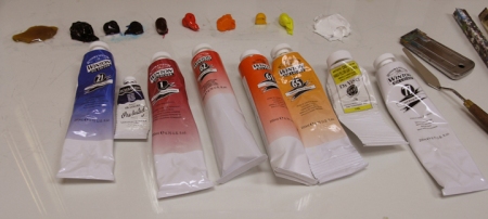
The other question was, “What brands of paint do you use?”  We mostly use Windsor Newton WINTON Oils in the 200ml tubes. We have found this is the best quality for the most economical price. The exceptions are Pthalo Blue, we use Grumbacher because the hue is more intense. And our Hansa Lemon Yellow is Da Vinci Paint made by the Da Vinci Paint company in California. I’m sure there are other brands of this that will work as well. We’re going to start trying some others because Da Vinci has really gone up in price.

Now I have a question for you. Can you find Slinky? He grew up in the wild and has learned the art of camouflage very well. I assure you, he is there. Enjoying the sun in his little hidy-hole! You can click on the picture to see it larger.

THERE HE IS! Slinky woke up, stretched, turned around and went back to his nap in the sun. Have a wonderful day. Hugs, Mikki Senkarik

Sign up to be on the TEAM SENKARIK Mailing List


Amalfi Splendor

January 26, 2011

Now for the planters. Cadmium Red Light is added to the color left over from the floor painted in the previous session (MUD + Cadmium Orange). This makes a rich, terra-cotta color just right for the Italian pots that will be filled with Canna Lilies, Geraniums and Nasturtiums.

Using my large Bright brush the terra-cotta pots are blocked in. The bottle of wine has been painted with one of those special colors we occasionally use, Sap Green.

Nasturtiums are painted with the corner of the large brush. The blossoms are mixtures of various amounts of Cadmium Orange + Alizarin Crimson and Cadmium Orange + Cadmium Yellow Medium. The foliage is a warm green made of Ultramarine Blue + Cadmium Yellow Medium.

The large leaves of the Canna Lilies are shaped with the side of the same large Bright brush. I especially like using synthetic Bright brushes. The bristles are shorter than a Flat giving me more control of the brushstrokes. Depending on how the brush is held I can make a very fine flower or a large, broad leaf.

Amalfi Splendor     24″ x 30″     Original Oil Painting on Canvas

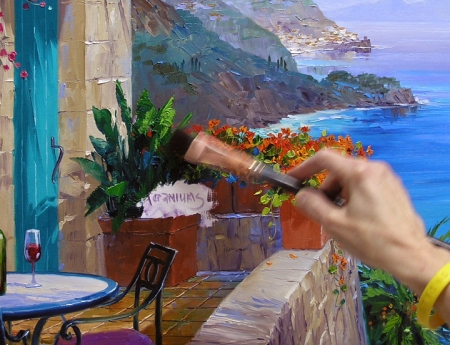
The warm, bright colors of the flowers make the cooler, distant bluffs fall even farther into the background. When I first began painting, bringing light into a piece was difficult. Jack made a suggestion that was very helpful. He said, “Think of light as paint in a bucket. Throw it into your painting.” It works. Starting in the lower right corner and looking left follow the sunlight spilling along the top of the wall, across the table top and splashing on the building and door. The Bougainvillea and its shadow stop the light, directing your eye up and back into the painting. But enough of technicalities.  Those comfortable chairs are just waiting for someone to come sit, have a sip of wine and enjoy the view. I’m ready, how ’bout you? Hugs, Mikki Senkarik

Website: http://www.senkarik.com

A Sunny Terrace

January 25, 2011

I’m using a different mixture for the creamy limestone building. The base colors are MUD (Ultramarine Blue + Alizarin Crimson) + Cadmium Yellow Medium + White. This makes a rich, yellow ochre hue. The four dabs of paint on the right are for the tile roof. MUD + Cadmium Orange are mixed for these. In all of the mixes more MUD is added to the darker tones, more White for the lightest. As usual a blob of Ultramarine Blue + White is mixed to provide coolness.

Notice in the picture above how the perspective lines in the indentations of the rock work give more depth to the painting. These, along with the top of the wall, function to direct the viewer’s eye to the distant village. At the left I’m using the mahl stick in order to steady my hand while painting the door handle with a mix of MUD + Liquin. I decided on green for the door because it’s the compliment of the pinks and reds in the surrounding flowers. This juxtaposition of complimentary colors will make them all appear more vibrant.

The limestone wall is now complete. Notice each individual rock is not completely outlined. I did that on the first rock building I ever painted and the result was definitely NOT satisfactory. Loosely indicating the rocks works much better for me.

The floor is painted with mixtures of MUD + Cadmium Orange. The tiles are warmer in the front and cooler (bluer) as they go back. The wrought iron chairs are drawn, wet into wet, over the floor. We took photos of these chairs at the Cloisters Resort on St. Simons Island, Georgia. We especially liked the graceful sweep of the arms and magenta cushions. The wine in the glasses is blocked in with a wash of Alizarin Crimson + Liquin, giving it a translucent look. I’ll finish off the wine bottle tomorrow!  See you then. Hugs, Mikki Senkarik

Sign up to be on the TEAM SENKARIK Mailing List


Leftover Paint

January 24, 2011

The layered cliffs along the Amalfi Coast are challenging to paint. The secret is to make each one a little warmer and darker in value as they come forward. Or in reverse, cooler and lighter as they go back! I make the closest bluff in shadow, providing a dark to accent the sunlit terrace in the foreground.

The water under this mountain is darker because of the reflections. Surf churning along the rocks at the bottom of the bluff will glow behind the orange Nasturtiums. In the foreground a mixture of Pthalo Blue + White + a bit of Lemon Hansa Yellow is used to make the water more intense. The light water running behind the dark palm gives distance, making it appear far below.

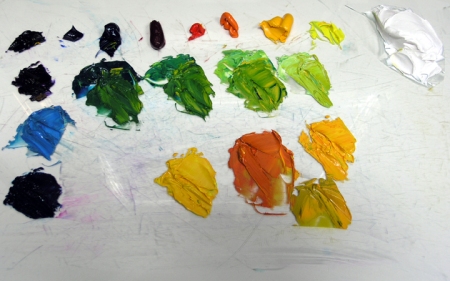
I’ve been asked if I use all of that paint out on my palette. The picture above shows my palette at the end of the painting day. There are a lot of little dibs and dabs of color. While cleaning up I mix similar shades together. The picture to the left shows the final result. All that color ends up in a few piles of paint. These I will recycle and use in color mixtures tomorrow. Thanks for visiting. Hugs, Mikki Senkarik

Sign up to be on the TEAM SENKARIK Mailing List


Let’s Go to the Amalfi Coast!

January 23, 2011

Santa Fe needs another 24″ x 30″ painting. I looked at our Gallery Board and decided an Amalfi Coast piece would work well with their current inventory. After going through pictures of the area I make a quick sketch. If this was for a commission I would make a more complete and detailed drawing for my client.

As I drew this up on the canvas I made a few changes. Instead of a pot of flowers on the table Jack suggested a bottle of wine and glasses. “Just seems kinda romantic,” he said. I certainly agree. The original sketch had a tile roof below the palm tree in the lower right corner. After getting the palm sketched in I decided to leave the rooftop out. I like the feeling of being high up on a precipice with only the water below.

I begin with the sky and most distant mountains. As the mountain is painted I work a little of the cloud color into the blue giving the appearance of sunlit mist hovering between the mountains. This really shows in the next photo.

Now for the distant village of Amalfi. I enjoy painting this area with its quaint little towns. We have such happy memories of the Amalfi Coast. Using a large brush I block in the mountain, then go back to indicate the buildings and old medieval tower. To see the image larger click on the picture.

Painting the water follows the rule, “muted colors recede, intense colors come forward.” A mixture of Ultramarine Blue + MUD (Ultramarine Blue + Alizarin Crimson) + White is used for the most distant water. Stepping forward, about the level of Amalfi, I paint the water with a mixture of Ultramarine Blue + White. Coming closer Pthalo Blue + Ultramarine Blue + White is used. In our next session I’ll finish the coast and water. See you then. Hugs, Mikki Senkarik

Website: http://www.senkarik.com

Refreshing Haven

January 20, 2011

My paint is mixed for the White Hollyhocks and we are ready to start our engines! I want a bright green for the leaves so a mixture of Pthalo Blue + Lemon Hansa Yellow is made. Various combinations of Ultramarine Blue + White, Pthalo Blue + White, as well as MUD + White will be used for the blossoms.

The flowers are blocked in first. I’m now working the foliage in and around the white. By painting the blossoms first their color remains crisp and clean. If I had painted the leaves first and then the flowers, the white would pick up some of the green, becoming muddy.

Using a small brush and stabilizing my hand on the mahl stick I paint the dark centers of the Hollyhocks.

Adding Cadmium Yellow Medium to the bright greens from the Hollyhocks I make warm greens for the Sunflower leaves. The color for the flowers have a Cadmium Yellow Medium base. MUD + Cadmium Orange is added for the dark. Lemon Hansa Yellow + Cadmium Yellow Medium is used for the highlights.

As with the Hollyhocks, the yellow Sunflowers are blocked in first. The foliage is then painted. A few strokes of Pthalo Blue + White are brushed in to add depth and interest to the leaves.

Using a #8 Filbert Brush dipped in MUD (Ultramarine Blue + Alizarin Crimson + a little Liquin) I add the centers of the Sunflowers.

Several of my readers have asked what brush I use for my signature. Well, now the secret is out. It’s a Fine Liner Brush! I like to sign my paintings in Cadmium Red Light mixed with a touch of Liquin to make it flow easier. Bracing my left hand on the easel, I rest my right (signing) hand on the left to steady it.

Refreshing Haven    24″ x 24″    Original Oil Painting

In painting one of the most important rules Jack taught me is “You can’t have light without dark.” The darkness of the wall and doors accentuates the sunlit scene beyond, allowing it to glow. The little stream, Hollyhocks and Sunflowers make for a Refreshing Haven on a bright, summer Santa Fe day. I’ve enjoyed your company. Please do come back and visit our studio again. Hugs, Mikki Senkarik

Sign up to be on the TEAM SENKARIK Mailing List


Adobe, Trumpet Vine and Tile

January 19, 2011

We love living in the country but you do have to make some compromises. We’ve been spoiled in our previous homes with High Speed Broadband Internet which we don’t have here. We do have a wireless setup but it doesn’t always work very well. Yesterday was one of those days. We just could not get online, so no Blog! We are back in business today so let’s get started. I’ve mixed my adobe colors above. The base is Cadmium Orange + Pthalo Blue + White. The darkest glob on the left has some MUD (Ultramarine Blue + Alizarin Crimson) added.

The adobe wall is lighter and warmer at the top where it is warmed by the sunlight above. Going down I make it cooler (Bluer) to drop behind the Hollyhocks and Sunflowers. When the wall is finished I block in the orange red blossoms of the Trumpet Vine. The greens of the foliage are painted next. The finishing touch is drawing the tendrils with a Fine Liner brush.

WOW! Do those Red doors ever make a difference or what? They really cause the soft gray-greens of the landscape to drop back. Now for the tile floor. I begin by painting the shadow areas, cooler toward the back, warmer in the front.

The sunlit portions of the floor are now painted. I drag the edges between the dark and light areas to soften the transition.

The final step on the floor is to draw the lines dividing the individual tiles. I pull out my Fine Liner brush again for this task, free handing the lines into the wet paint of the floor. We’ll start planting Hollyhocks and Sunflowers next. Get your garden gloves and come help! Hugs, Mikki Senkarik

Website: http://www.senkarik.com

A Sunny Day in Santa Fe

January 17, 2011

My first step is to mix the paint I’ll be using for the sky and desert foliage. Notice all of the colors lined up on the left side of my palette. This is the extra paint remaining from my last piece, A Blanket of Beauty. I use these colors as the base for the mixtures in the Santa Fe landscape.

In order to accentuate the White Hollyhocks in the foreground I decided not to have any clouds. So this will be a typical, clear blue New Mexico summer sky. Near the horizon I use a mix of Pthalo Blue + White. A slightly darker mix of Ultramarine Blue + White is used in the sky near the top of the arch.

The mountain in the far distance is made blue so it will fall behind the warmer bluff. Saved colors are used for the bluff, sage, chamisa and the rocks along the stream. When painting a stream the rocks are blocked in first. I then paint the water above the waterfall with a mix of Ultramarine Blue + White. In the front pool the water is brighter so it will come forward. Here I use mixes of Pthalo Blue + White, with a tiny bit of Lemon Hansa Yellow added in the very front.

Reflections are fun to paint. After the stream is completely covered I use a large Flat brush to pull the rock color straight down into the water. Next time you are near a quiet body of water observe the reflections. The water acts as a mirror, with the reflected image directly underneath the source. Because the water I’m painting is choppy the reflections aren’t exact mirror images. Instead they are indications of the colors above the flowing water.

At the base of the rocks a lighter, broken stroke is made to delineate the foam that collects along the edge. The top of the waterfall is bright because the sunlight glistens on the flowing water. The bubbling stream is now complete. Jack and I love these through the door paintings at this stage, with the scene finished and the rest of the piece sketched in. “Looks kinda cool,” as he would say! To proceed through the step-by-step click on the title and arrow in the upper right corner of the page. Hugs, Mikki Senkarik

Sign up to be on the TEAM SENKARIK Mailing List


New Arrivals

January 16, 2011

We had some new arrivals fly in and land on our pond this morning. We weren’t familiar with some of them so we had to pull out the Audubon Field Guide. Scaups and American Wigeons, what a treat! I wish I could have gotten closer to get a better picture but we were afraid they would fly away if I did.

Clicker Bobbie, our resident great white egret, and the Northern Shovelers retreated to the southern edge of the water.

Meanwhile Harry the Heron and another batch of Northern Shovelers continued to feed, totally ignoring the newest members of the Senkarik Pond community. If you would like to see any of these pictures enlarged just click on the image.

We just sat and watched for a long time, enjoying the tranquility of the scene. But reality hit, Santa Fe has sold several pieces and needs replacement paintings for their walls. As Jack likes to say, “They can’t sell out of an empty wagon.” So back to the easel. This painting is going to be pure Santa Fe with bluffs and chamisa in the background. Hollyhocks, Trumpet Vine and Sunflowers will fill the foreground courtyard.

We’ve had many new visitors to my blog in the last several days. Jack and I will be a little more welcoming than Clicker Bobbie and Harry the Heron. We want to extend a Hearty “We’re Glad to Have You and, as we say in Texas, MUCH OBLIGED!” Please come back tomorrow and watch me paint. Hugs, Mikki Senkarik

Website: www.senkarik.com